Mobile App
☆
Mobile App ☆
Seek Sight
Allowing people to choose what they seek 👀
Solo UX Researcher and Designer
👤
Role
DesignLab Bootcamp Project
Project Type
🗃️
3 Months
Timeline
⏳
Figma, Notion, ChatGPT, Facetime
Tools
⚒️
User interview, literature review, affinity mapping, storyboarding, personas, user flows, style guides, wire framing, prototyping, usability tests
Skills
💪
THE PROBLEM
Finding an optometrist shouldn’t be a guessing game.
For many people, choosing the right eye care professional is often based on proximity or a few inconsistent online reviews. There’s a lack of centralized, user-friendly platforms that allow individuals to compare optometrist based on what truly matters to them-be it years of experience, specific specializations, patient reviews, insurance compatibility, or even personal preferences like gender or communication style.
THE IDEA
How might we effectively help people to find an optometrist who meets their needs?
I set out to design a solution that puts the user in control of their eye care choices - introducing SeekSight, a mobile app designed to help users find the best eye care professional for their unique needs.
-
Discover
-
Define
-
Develop
-
Deliver
Discover
COMPETITIVE ANALYSIS
A lack of personalized, secure and accessible solutions
Gaps in the optometry industry:
To understand the current market and its offerings, I conducted a competitive analysis of optometry websites, revealing the need for accessible and adaptable solutions with the flexibility to filter needs across different requirements—making finding an optometrist both efficient and simple. Websites like College of Optometry of Ontario offer memberships, allowing users to have access to specific perks but fees are hidden until the end. Meanwhile, Canadian Association of Optometry’s website is not easily navigable. Sometimes a new look can make the experience 20/20.

USER INTERVIEWS
To design a relevant solution, I needed to understand:
How users currently search for optometrist
What factors influence their decisions
The pain points in the current experience
Understanding the User:
Interviewee demographics:
7 interviewees
Age range 20-80 years old
Key Insights:
💡 “One size doesn’t fit all”. Users wanted to filter providers based on personal priorities, not generic ratings
💡 Trust was often built through patient testimonials, provider credentials, and clear communication
💡 Convenience (location, hours, insurance) was important - but not at the expense of quality

Define
AFFINITY MAPPING
Synthesizing research insights
I created an affinity map to organize the insights from the user interviews. This helped to condense the insights into several digestible main themes.
Main themes:
Healthy lifestyle is important
Screen time has increased significantly
Finding time to go to the optometrist is challenging
Reviews and qualifications are key factors
Affinity map of research insights (Figma link)
HOW MIGHT WE
Choosing a focus
I turned the main themes from the affinity map into “How Might We” statements to set a focus for ideation in the Develop phase.
…visually surface an optometrist’s track record (e.g., years in practice, patient-reported outcomes) in a way that’s both engaging and easy to scan?
…make booking appointments a positive and stress-free experience?
How Might We
…gamify or reward users for maintaining regular eye‑care habits (e.g., booking annual checkups, updating their vision history)?
PERSONAS & STORYBOARD
Characterizing the research insights to guide ideation
I turned the ““How Might We” statements into personas to foster empathy during ideation. Then I created a storyboard to illustrate the typical struggles a persona would face when finding an optometrist. That is how I came up with the title “SeekSight”.
Hillary - Busy student, in need of finding an optometrist that will get covered by insurance
Megan - Working mom, trying to find the easiest way to book an appointment
Bonnie - Retired senior, looking to find the best optometrist for her medical needs
Persona - Megan (Click to enlarge)
Persona - Hillary (Click to enlarge)
Persona - Bonnie (Click to enlarge)
Develop
IDEATION EXERCISE
Diverging my thinking
I started with a quick ideation session to explore ideas openly and question my assumptions.
-
I set a timer and an ambitious goal which sparked intrinsic motivation and inspired me to let go of half- formed ideas and push beyond conventional boundaries.
-
I explored analogous inspiration by looking at the medical industry which shares a similar focus on healthcare management. This helped me see how I could integrate features inspired by successful tools from the health care world, by encouraging users to effortlessly navigate the app, manage appointments, access resources, and foster a sense of community and support, all through a unified and user-friendly interface.
FEATURE PRIORITIZATION
Selecting ideas to develop based on research
Having generated a wide range of ideas, I prioritized several of my MVP (most viable product) based on the user needs identified through research.
Create account
Appointment scheduling
Input personal constraints/preferences
Appointment reminders/nudge
Find an optometrist page
Must haves:
Integrated health marketplace
Medication adherence tracking
Future developments:
USER FLOW
Task:
Log in / Sign up
Task:
Find an optometrist
Task:
Book an appointment
Visualizing the user’s journey
I structured the information architecture of the potential solution by mapping essential features into screen and user interactions using a user flow.
This user flow illustrates how a user would navigate the app to complete three core tasks:
Log in / Sign up
Find an optometrist
Book an appointment
Deliver
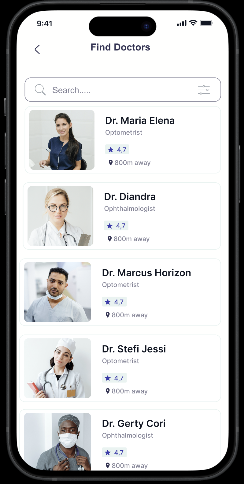
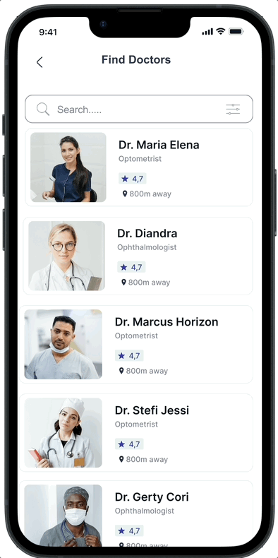
LOW FIDELITY WIREFRAMES
Ensuring designs are effective
I began the Deliver phase by designing wireframes for the "Find a Doctor" and "Book an Appointment" tasks.
While the "Log In / Sign Up" flow was included in my user flow, I chose to prioritize the other two because they are more distinctive and central to my project's value proposition.


BRANDING & STYLE GUIDE
Representing the brand visually
When developing the product I had a clear mission: to make healthcare access feel trustworthy, transparent, and effortless. Every design decision was guided by four core values:
Trust — Ensuring users feel confident in the information, providers, and decisions they make through the platform.
Transparency — Presenting clear, upfront details about doctors, costs, and availability to eliminate uncertainty.
Simplicity — Designing intuitive, friction-free experiences that reduce stress and help users find care fast.
Accessibility — Building an inclusive experience that supports users of all abilities, languages, and devices.
Brand values
The name SeekSight captures the essence of what this product sets out to do — empower users to find clear, trustworthy care, starting with their vision. Rooted in the act of seeking support and improving sight, the name reflects both the functional and emotional journey of finding the right optometrist. Just as optometrists help people see more clearly, SeekSight was designed to bring clarity, trust, and confidence to the healthcare search experience.
Why SeekSight?
I selected ADLaM Display for its readability, approachable aesthetic, and visually inclusive design. The typeface features large, rounded letterforms that make it easy to read at a glance — a key consideration for users who may already be dealing with vision challenges. Its clean yet distinctive style reflects the brand’s values of simplicity, accessibility, and trust, while adding a warm, modern personality to the visual identity.
ADLaM Display typeface


First and second renditions of the logo

SeekSight Mood Board (Click to enlarge)

Components (Click to englarge)

Colour (Click to enlarge)

Type (Click to enlarge)
MID FIDELITY WIREFRAMES
I began the Deliver phase by designing wireframes for the "Find a Doctor" and "Book an Appointment" tasks.
While the "Log In / Sign Up" flow was included in my user flow, I chose to prioritize the other two because they are more distinctive and central to my project's value proposition.
Creating targeted wireframes to highlight key features


USABILITY TESTING & HIGH FIDELITY PROTOTYPE
Representing the brand visually
I performed usability tests on the mid-fidelity wireframes with six participants. Here is the feedback I encountered and the new design considerations for the iteration into the final prototype:
Brand values
Scrolling effect (Left)
Implemented a scrolling interaction to allow users to easily browse through the list of available doctors
Font changes (Middle & Right)
Increased the font size on the calendar to make it easier for users to view the dates
Adjusted the text colour to a darker shade to enhance readability and improve visual accessibility for users
Calendar (Middle & Right)
Developed an interactive calendar that enables users to select their preferred appointment dates and time seamlessly


100%
task completion
2 mins
average time to complete tasks
1 average
difficulty rating out of 5
REFLECTION
Learning as a designer
Engaging with users of diverse needs and abilities early in the project proved crucial for designing an inclusive medical platform. By focusing on empathy, features were developed that truly resonate with users, meeting their needs effectively in a short time. The importance of emphasizing accessibility in UI through colours and contrast, hierarchy and guiding the user visually throughout the experience.
The SeekSight platform has the potential to make a significant difference in the lives of users by streamlining critical processes. By integrating user feedback into the final design, the platform is poised to enhance user satisfaction and empower users to achieve their goals efficiently. This impact aligns with the mission to provide an intuitive and reliable tool for the optometry community.
Future directions:
The next phase involves fully developing the platform's existing features to ensure they function seamlessly. This will lay a solid foundation for subsequent testing and refinements.
Once development is complete, further user testing will be conducted to evaluate and improve usability. Iterative adjustments will be made based on feedback to achieve optimal success metrics.
Future plans include incorporating AI assistance and camera/scanning functionalities. These enhancements will be developed and iterated upon to provide users with an even more robust and comprehensive experience.